Final Magazine

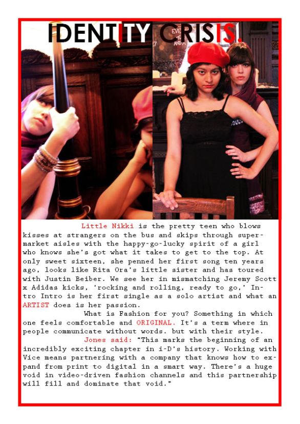
Today was our last lesson for the term. We had to produce our final magazine spread. We followed the same procedures as we did during all the digital imaging classes. I retouched the photos a little on Photoshop to make it look more appealing 🙂

Have a look xx

final magazineovpp – PDF

Image

Image

Image

Image

Weekly Reflection : The digital imaging class this term has definitely help me, not only to produce such magazine spreads but also, in terms of communicating something visually, since I am taking up Fashion Communication as my career. Such catchy pages are definitely needed to increase the aesthetic value of an idea or as a way of communication. Over all, I am very pleased to have learned something SO DIFFERENT! For a first timer, InDesign was very useful indeed!


Back to Photoshop!

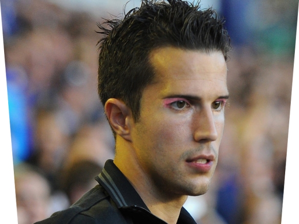
In today’s class, I got asked what I have against Robin Van Persie, which I found a little humorous when I started turning him into a woman 😛

Couldn’t upload a PDF file on here, some problem with the file considering it’s done on photoshop, it probably left the layers on.

Key terms:

Filter> liquify

Spot healing brush tool

Healing brush tool (press alt first)

Patch tool

Red-eye reduction

Filter> Smart blur

Dodge tool

Burn tool

We retouched the picture. Almost like morphing RVP into a woman! He’s still attractive though!!

Weekly reflection – Turning RVP into a Woman was definitely a task for me, mentally 😛 But I did learn to use the retouching tools very well, liquifying images can make them look so much more appealing! I can use it on my photographs too now!

Before :

Everton-v-Manchester-United-Robin-van-Persie-_2814657 After :RVP morphjpeg

Told you, he’s still attractive 😛

x

Week 3 : Some important elements learnt.

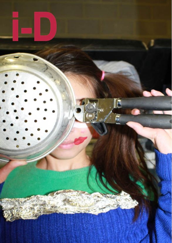
i-d – PDF File

Character options (options menu for type tool) for making text taller, fatter, further apart, etc

Fill colour –

Stroke colour – outside frames, outside text that makes the text bold

Underneath Rectangle frame tool are the ellipse and polygon frame tools for more unusual shapes

Swatch palette > create new swatch > double-click on it > use the slider to get the colour you need

i-d i-d2

Weekly reflection – I learned clearly how magazine pages are tweaked in InDesign. The final, clear-cut layout is enhanced on InDesign. My work kept getting better ever since the first class, and I was even becoming faster at it! I realized that I couldn’t get enough of the tools on InDesign, I kept wanting to explore more even after class was over!

More InDesign!

PDF Files : lesson 2jpeg

Today some of the crucial elements were learnt in InDesign were :

Bleed

Slug

File> Place

Direct selection tool (White arrow) to select the image inside

Type > Placeholder text

File (color inside)

Stroke (color outside an object)

Image

Image

So here’s it 😀

I ended up doing 2 of them in class today!

Weekly reflection – I enjoyed today’s class as we learned how we could combine our styling assignments into the magazine. I used some of my styling research into InDesign’s pages. Just images though. David Bowie looks exceptionally insane in my pages! :))

First InDesign Class!

Untitled-1pdf Untitled-2pdf – PDF Files

I was so intrigued to learn a new computer software apart from Photoshop, specially since it involves a lot of magazine editing! One of my favorite all-time reads are Magazines.

So, this is how we started off:

1. We created a new blank document, an A4 one with : 1 page and 2 columns.

2. Now the rectangle frame tool came into operation! We used this tool to create boxes where we could type out our text and place images.

3. Now come’s the catchy title! We used the type tool on the tools palette to create text into the frame we drew out and to make it look prettier, we changed thecolour(“swatches”) and size of the text.

4. Selection tool – This is the black arrow at the top of the tools palette which is used to select the frames and resize them just incase you want to.

5. On saving some images found from Google and Tumblr, I wanted to place them on my magazine page. Since you can’t “open” an image on InDesign, we used the “place” option which correctly placed our photos, we could either choose to fit or fill the frame proportionally.

ImageImage

Weekly reflection : A fun class in which I’ve got lots to explore! Obviously, because I started learning something different! A new Adobe Software other than photoshop 🙂 I was pleased to know that it would help me produce magazine layouts in the future as it is very appropriate to my course next year, being Fashion Communication 🙂

Have a good weekend 😀

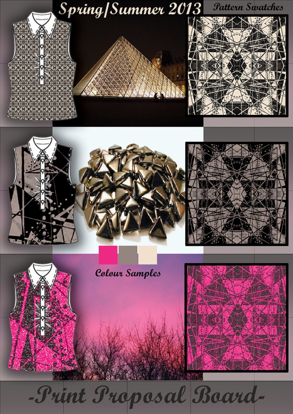
Print Proposal Board

Today, In Photoshop we learned how to create a print proposal board. We added fabric to our garment using a technical image of a garment which had no filled fabric or texture. We used another image from one of our research and added that to the garment, this is how my garment looked before I started adding swatches to it.

My garment

This was my pattern swatch

We started off with our Print Proposal Board from now :

Firstly, we opened our pattern on photoshop, then using the rectangular marquee tool, we made a square selection of a part in the pattern that we wanted to add on our garment. The dragged this selection to the page where my garment was opened. Then, I resized my sample layer (Edit>Transform>Scale>Resized it by holding down shift).

Then we duplicated the layers so we would have a few more pattern swatches to apply (drag the layer with your pattern to the ‘create new layer icon’ in layers palette.

Mirror the duplicate layer (Edit>Transform>Flip Horizontal). Now, I merged two layers, by holding down shift on the first layer, then the second layer, held down shift, right click > merge layers. Now save the pattern in the jpeg format.

Adding the pattern to your garment :

I opened my technical image on photoshop, by using the magic wand tool from the tools palette, I chose where I wanted my pattern to be added to my garment. Now I had to convert the pattern into a swatch, I went back to my pattern document (edit>define pattern>named it as whatever I liked>ok)

Adding the pattern swatch to your garment :

Click on the technical drawing once, go to layer > new fill layer > new fill layer > pattern > choose by typing the name you saved your pattern as > scale > ok. Patterns can be re-scaled as and when wanted. In the end, I added some drop shadows and strokes to make it look presentable! 🙂

My Print Proposal Board looks neat and tidy with a few inspirational images 🙂
 

Fashion Illustration

Today, we learned how to edit our own drawn fashion illustration. I opened one of my fashion illustrations which I had previously drawn. I converted this image to black and white so I could add my new effects to it. To add colour to it, we had to make a new layer and then fill the selected area with the preferred colour. To colour a particular area, we had to make a selection with a polygonal lasso tool. Then go onto Edit>Fill>Colour>Choose colour>Ok. To refine the edges, one can either use the eraser tool to rub out the extra bits or the paint brush tool to fill in the selected colour. I added a lighting effect to our illustration to make it appear as thought it’s 3D (Filter > Render > Lighting Effect > Manipulate the dots and choose position of your limelight > Ok)

I also applied a photographic texture to my illustration, its attached on top of the trousers (scroll down and check the image below for details) I firstly selected the area where I would like my texture to be added with the help of the polygonal lasso tool. In photoshop, I opened a texture that I’d like to add, then selected an area on the texture that I wanted to use on my illustration (Rectangular Marquee tool and select the area the I want to add, Edit > Copy), then I went back to my Illustration (Edit > Paste into)

Voilaaa 😀 It’s ready!

In today’s lesson we learnt how to apply blending modes, adjustment layers, layer FX, strokes and colour fills. 

Blending modes help to change the way layers sit on top of one another. Varied blending modes will give layers different appearances. I places two layers on top of one another on my board. The blending mode is found on the top, right-hand corner of the layers palette. Next, I changed the blending mode of my top layer. I figured that it gives totally different appearances and looks which intrigued me!

Adjustment layers enable you to quickly change the looks of a group of layers at once. These can be dragged up and down the layers palette just as a regular layer.

Layer FX are great tools to add depth to your 2D designs. They make individual items stand on complicated or intricate designs. There are many kinds of FX layers to play around with! We were taught how to use Drop Shadow FX and Outer Glow. How to add an FX layer? –> Go to Layer –> Layer Style –> Choose and FX style from the given menu –> Adjust variables –> Ok. Tadaa 😀 Done.

Layer Strokes : These are utilized for visually separating layers or images from one another. A stroke is just like a border in PhotoShop. Click on the relevant layer than you want to apply a border to (Edit – Stroke – Choose width and colour – ok)

Fill Colours : They colour shapes and selections. I first selected the area that I wanted to colour (Edit > Fill > Choose colour > Ok). You can also change the shades and tints of the colour!

Next we needed to add a text layer to add some text to our concept board. I did so by going to the tools palette and selected the type tool. Then I clicked on my board and dragged the text box onto it. I changed my colours and font while typing my text, it looked brilliant!

All editing functions cannot be added to the text layer. To add a layer FX to a text layer, I had to Rasterize the Layer(Right click on the text layer from the layers palette, select ‘Rasterize Type.’ Now, when a text layer is rasterized, you cannot alter the size, font, alignment. My text layer had now become a normal image layer 🙂

My concept board basically shows my colour theme that I’m working with for my Mechanic – Organic project. I am trying to experiment with new colours that would probably suit Autumn/Winter 2013.

My finished assignment for the day 😀 How do you’ll like it?

Another photoshop trick!

My wheel cutout 😀

This lesson we learnt basic selection tools, lasso tools, feathering, editing selections, removing backgrounds. We were introduced to the Rectangular Marquee Tool which is used to make square or rectangular selections. We were asked to scan in a fabric in class and open it in Photoshop CS4. Some students found it better to rotate the fabric as some fabrics have natural creases on them [Rectangular Marquee tool –>> Edit –>> Transform –>> Rotate –>> Manually Rotate –>> Enter]. I used the rectangular marquee tool to make a perfect square selection by holding down the ‘SHIFT‘ key while drawing out my selection area to achieve this. I dragged this selection of my fabric onto my Concept Board.


This was after I inserted my wheel cutout onto my concept board 😀

Making selections from irregular shapes :

The Lasso Tool : This tool is used to make freehand selections. When you run your mouse around the image, it cuts out the sides of the image in a freeform pattern.

Polygonal Lasso Tool : This tool is great for cutting out images that have straight edges and angular ones as well!

While I was cutting out images, both these tools start off by usage of an anchor point on the image and it goes on till you end your selection and finally cuts off the rest of the image and leaves the part of the particular image that you wish to work on. To further refine my image and to remove extra bits that you don’t need, I used the eraser tool. This leaves the image neater (I have done so on my image, above)

I now used the feathering on the particular cutout of my image (Select -> Modify -> Feather) 5 pixels or more of feather makes the image soften it in such a way that is obvious to the eyes, 1 pixel leaves a subtle softened effect.

In the end, we edited the colour of our selection by going to Image > Adjustments > Hue/Saturation > Manipulate the Hue Slider > Ok.

Hoping to learn much more in the next few lessons, Keep reading! xx 🙂

First photoshop assignment! :)


Finally I got a head-start to my photoshop lessons! Our assignment is based on the theme; “Mechanic-Organic”. To start with, our tutor told us to search images for Mechanic and Organic on any search engine. For e.g. : Google, Bing. We were asked to look for a variety of mechanic and organic objects by typing things that relate to these topics on Google Images/Bing/Yahoo etc. On saving these images into specific folders, I opened Photoshop CS4.

I was then guided to go onto Image > Image size > Change Resolution from the photoshop browser on top. Resolution refers to the quality of an image. I chose the resolution as 72 ppi for my blog, for images that have to be printed, one uses the resolution as 150 ppi or more. We were also taught to change the colour mode of an image, i.e : refers to the image’s final outcome. The correct colour mode chosen will give you better results. I chose my colour mode as RGB (Red, Green, Blue) as its going to be viewed on screen. CMYK (Cyan, Magenta, White) is usually used when images have to be printed. Once we started adding our images onto Photoshop, we were taught to create layers for each so its easier to manipulate them as we go on. We named each layer and tried experimenting with them by placing them above/below different layers. The next thing we did was varying with opacity. This helps give a transparent effect to images making them “see-through”. This allowed images to be seen through the particular image that had it’s opacity changed. I was now introduced to the tools palette. One of the first tools I used was the Move Tool which is the most primary tool which anyone would use while learning basics in photoshop! This allowed images to move and shift from it’s original place.

Overall, today’s assignment seemed quite interesting and I’m quite intrigued to know what’s going to happen next!